Maser
Brand
Bel
Year
2023
Deliverables
Brand Identity
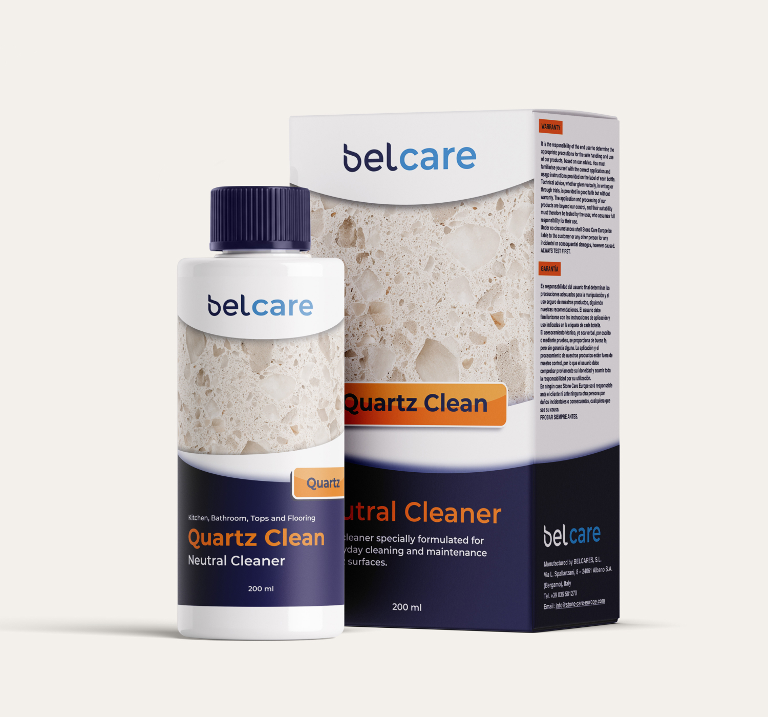
Packaging
Print
The Brief
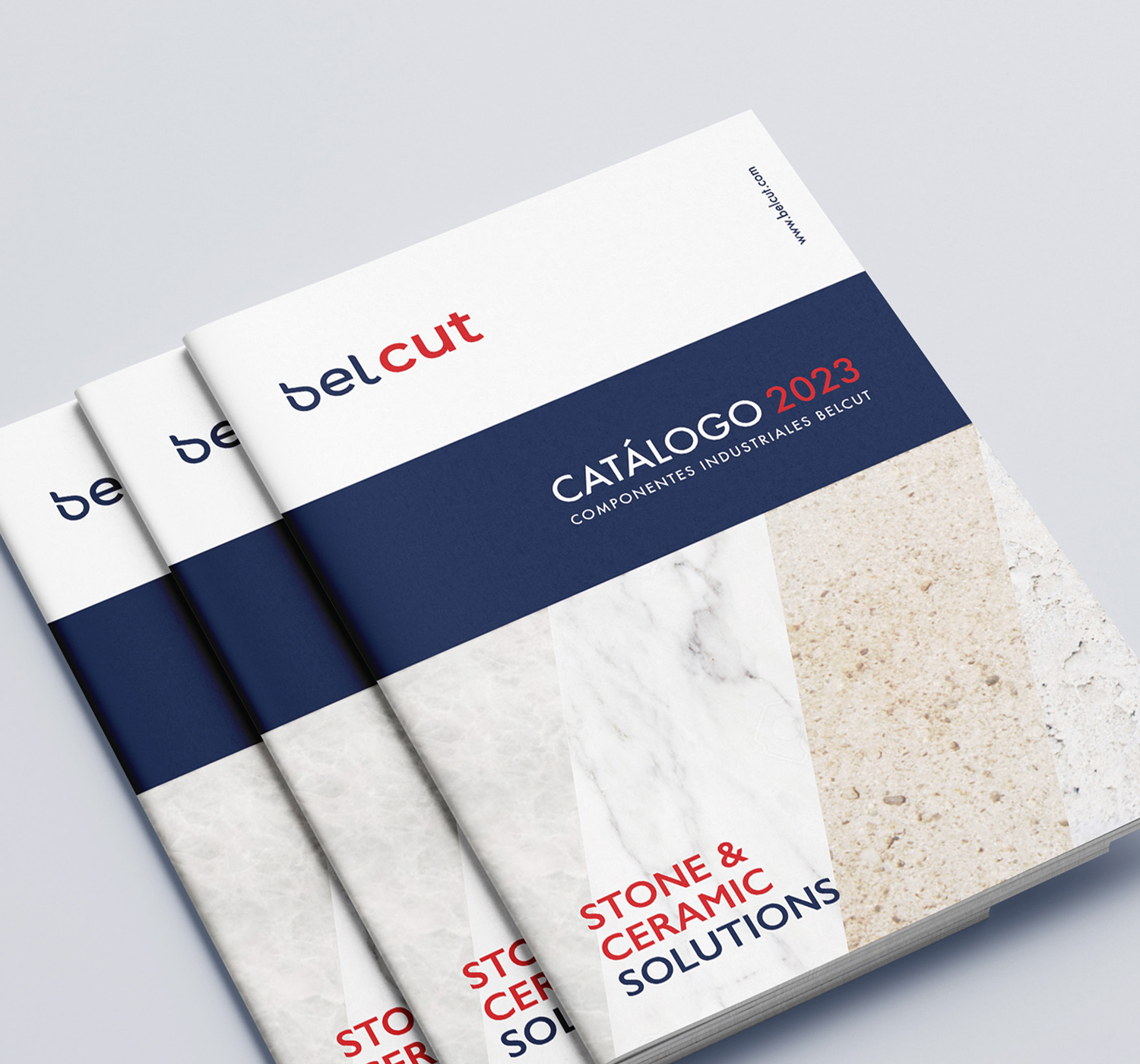
Bel was a new brand created by Maser, specialising in products and tools for the stone and ceramic industry. It was divided into two sub-brands: BelCare, offering cleaning, repair and surface treatment products, and BelCut, specialising in cutting and machining tools.
The brief was to develop the brand from the ground up, creating a visual identity that brought both ranges together while giving each its own recognisable character.
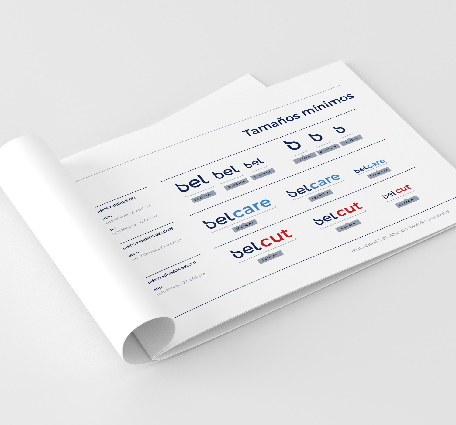
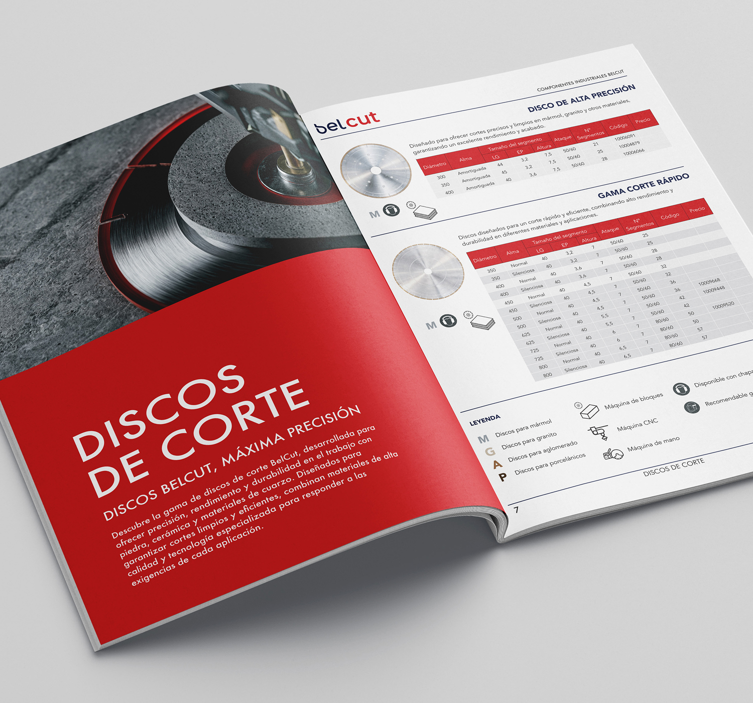
Working as a freelance designer, I led the creative process from the initial concepts to the development of the visual identity, brand guidelines, packaging and print design.
The Solution
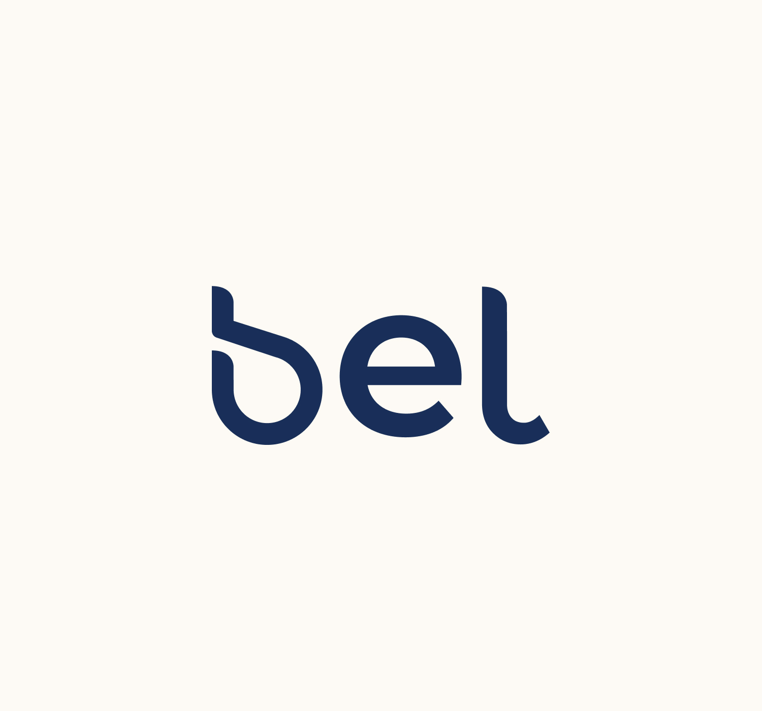
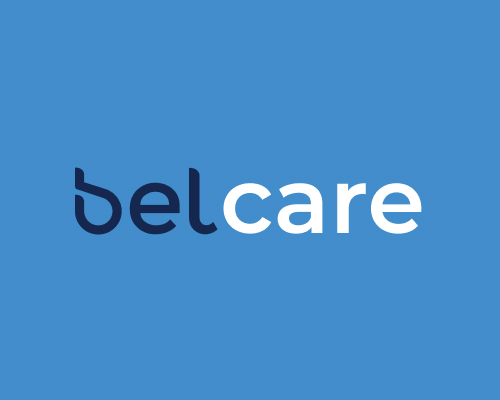
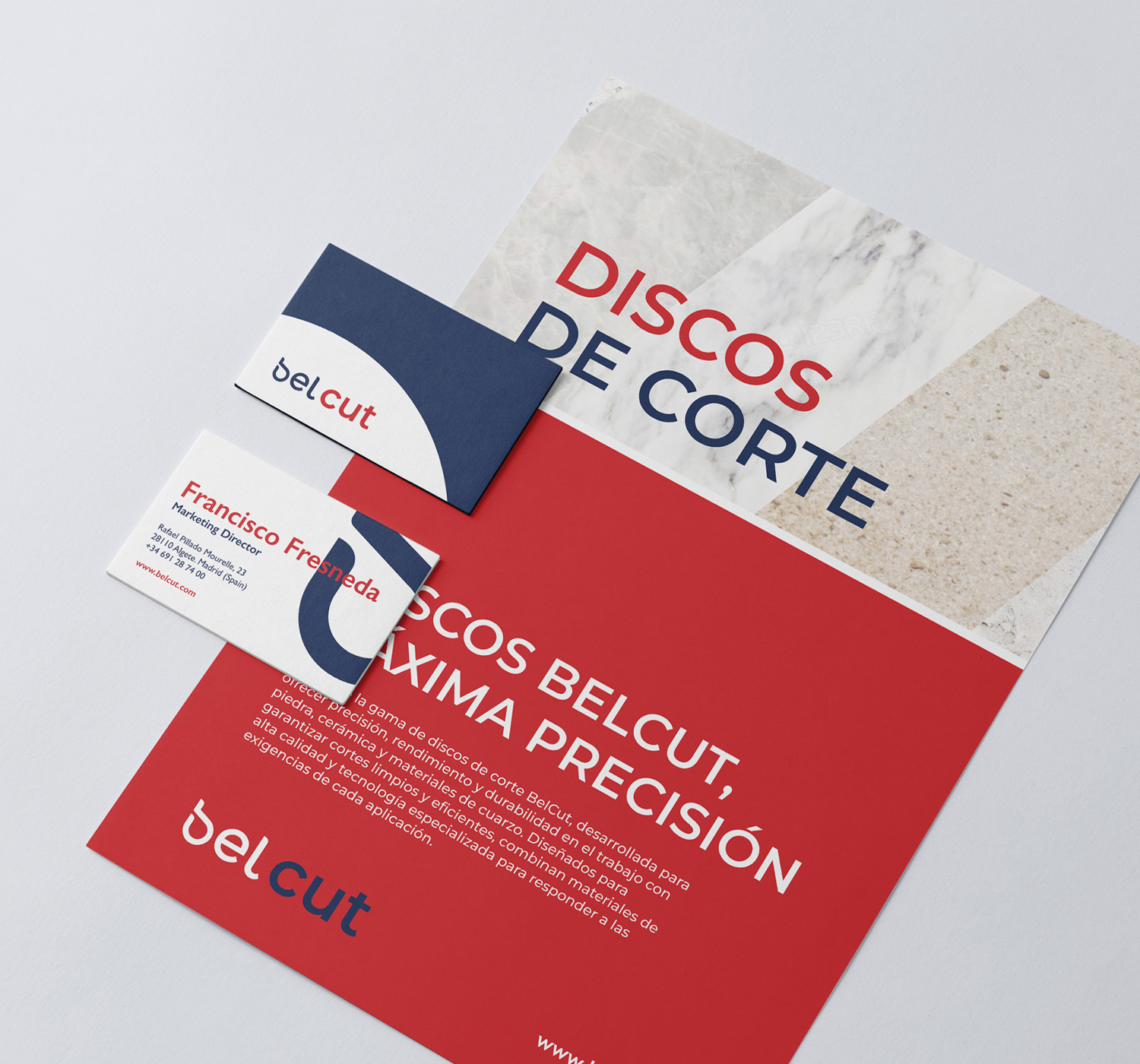
The visual identity centred on a bespoke lowercase ‘b’, combining two elements to represent the sub-brands: a drop-shaped form referencing BelCare’s treatment products and a cut in the letter symbolising BelCut’s stone-cutting tools.
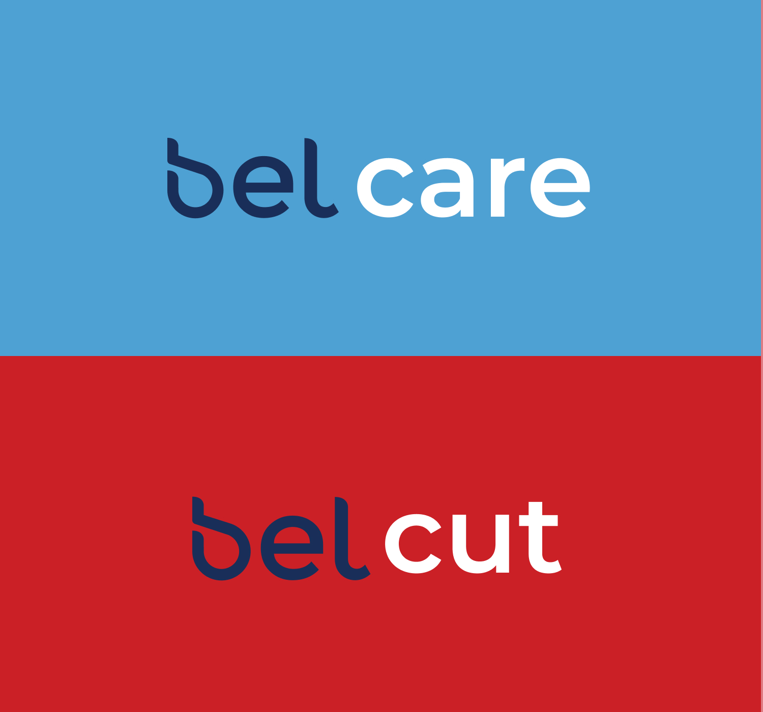
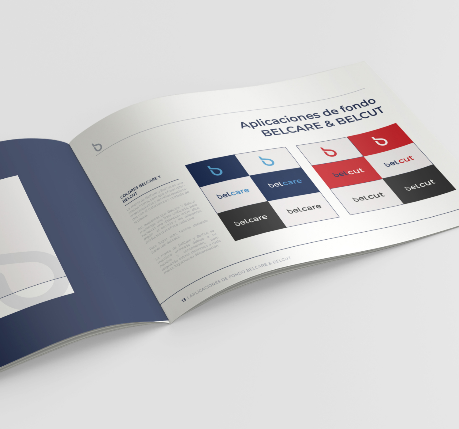
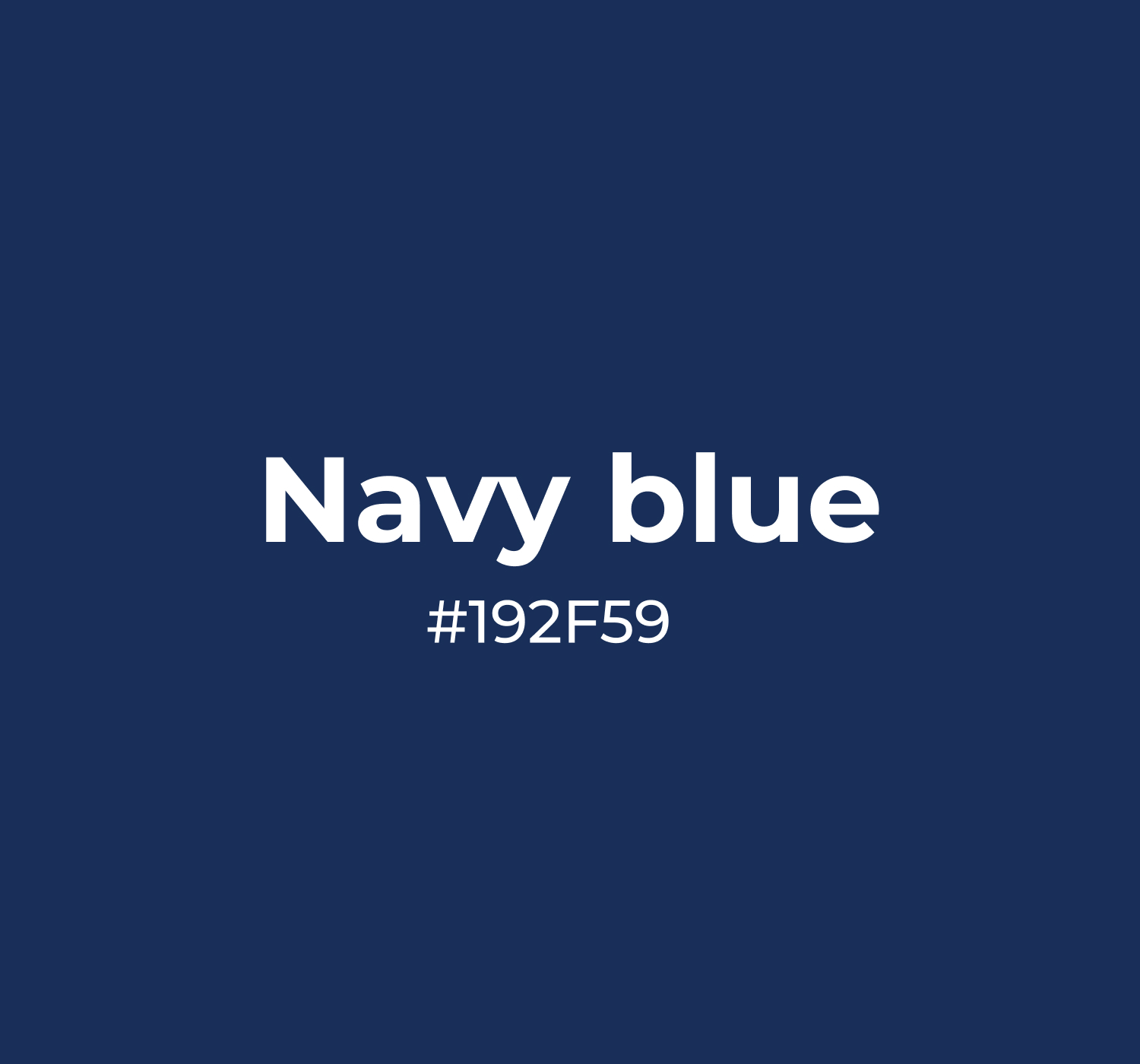
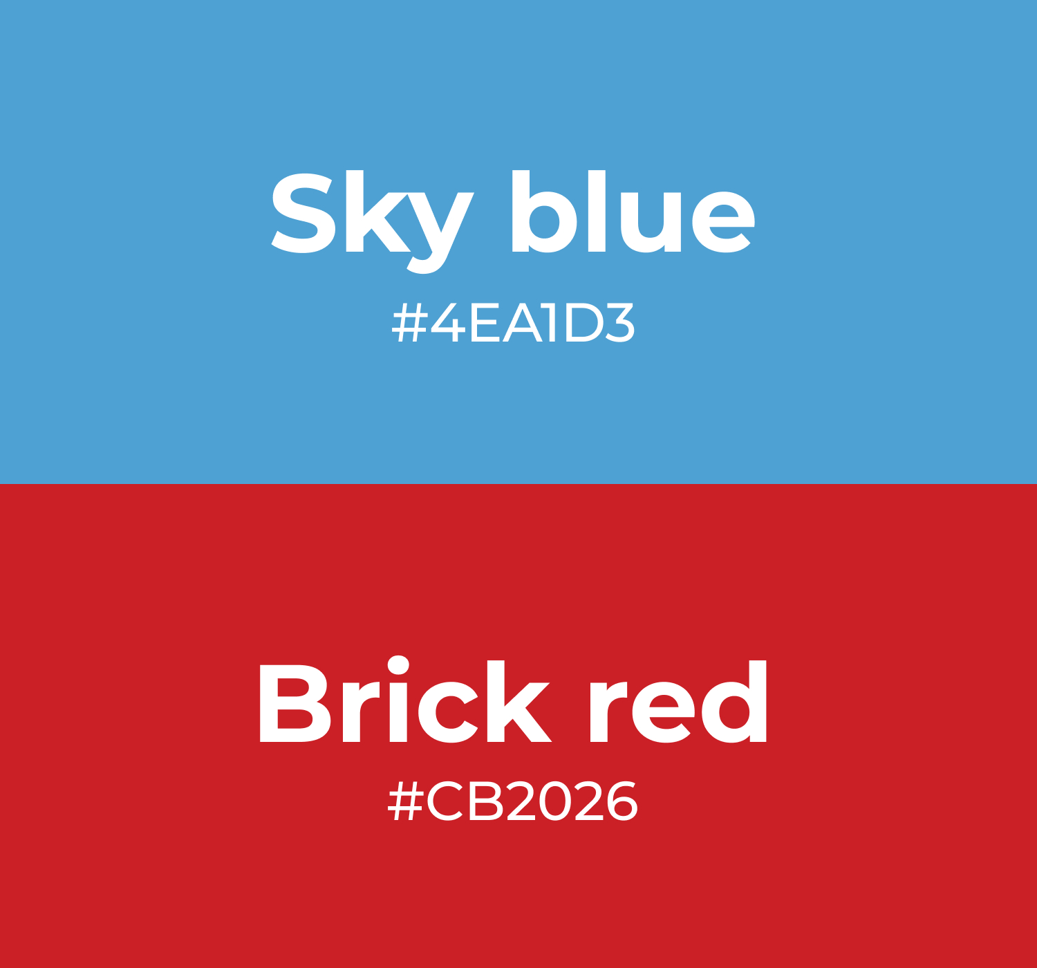
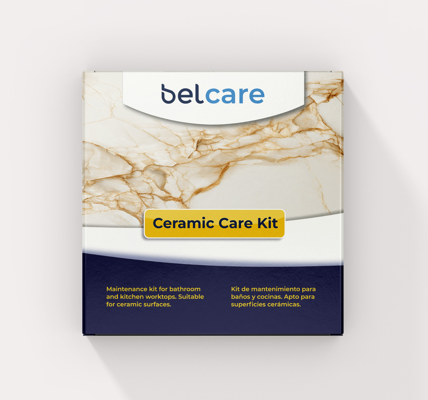
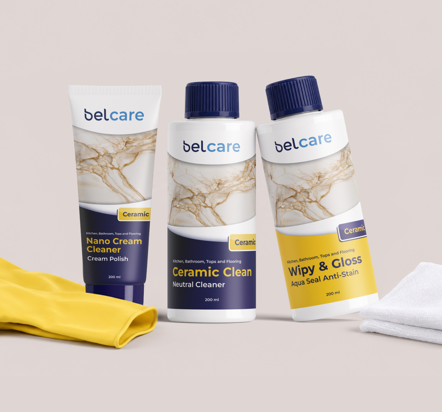
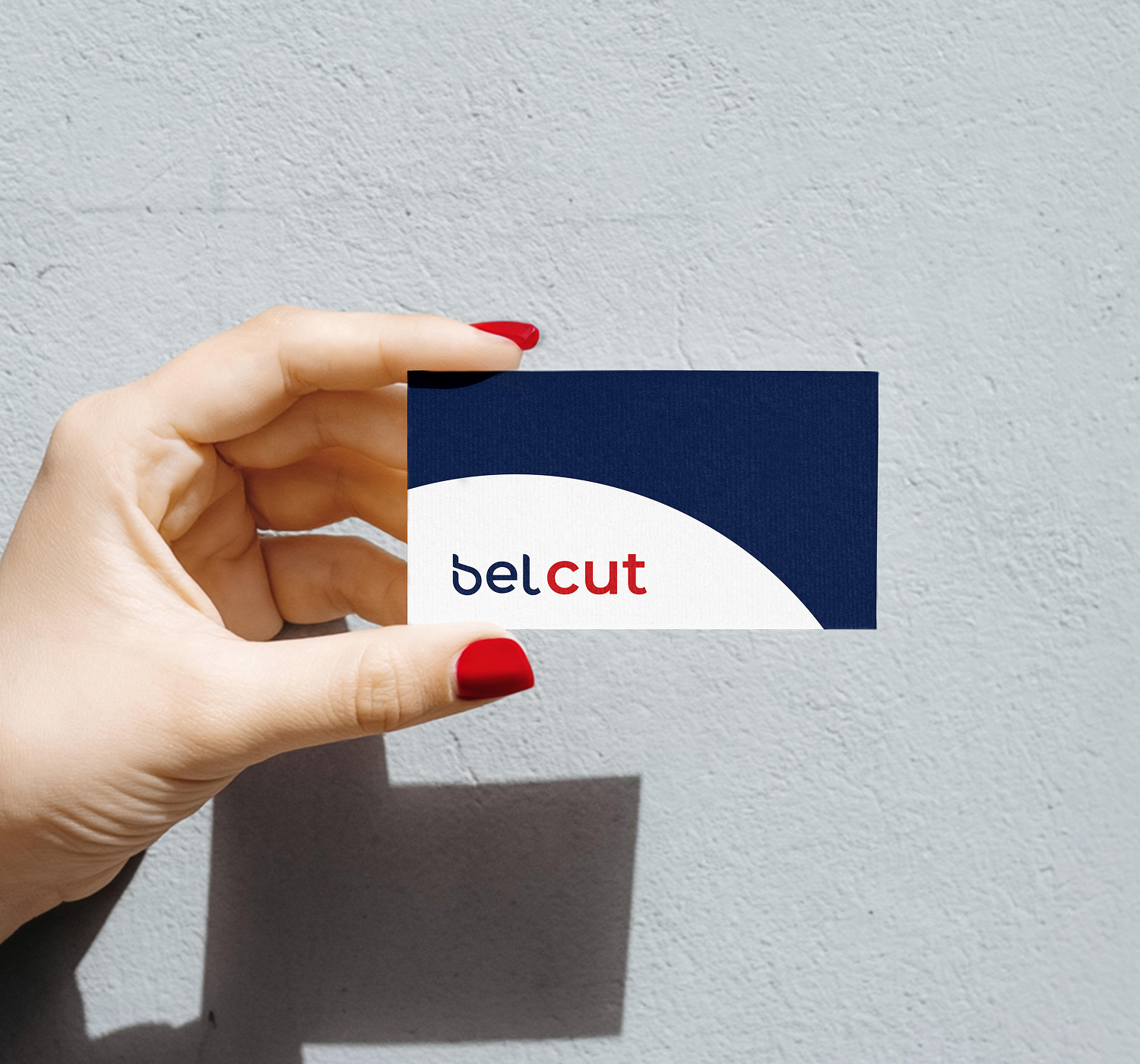
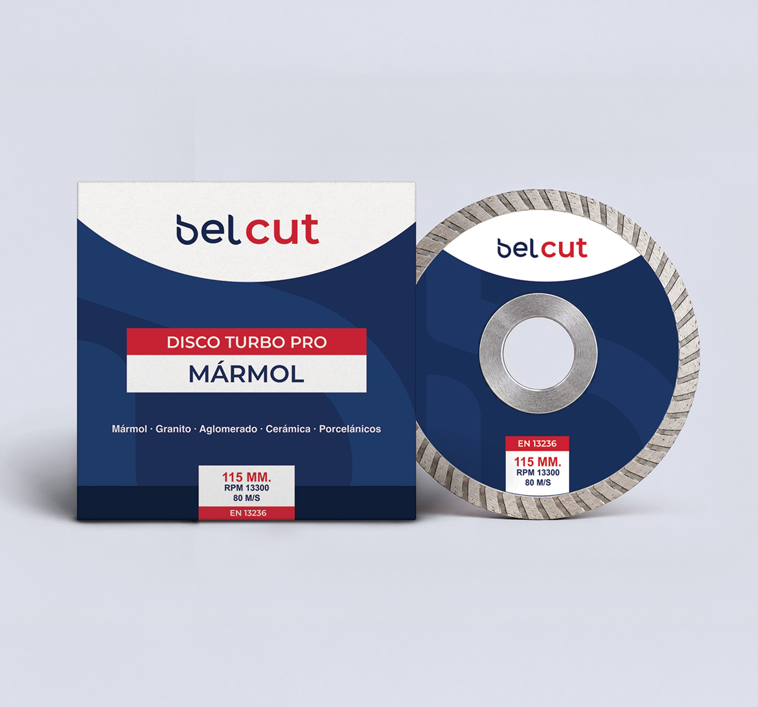
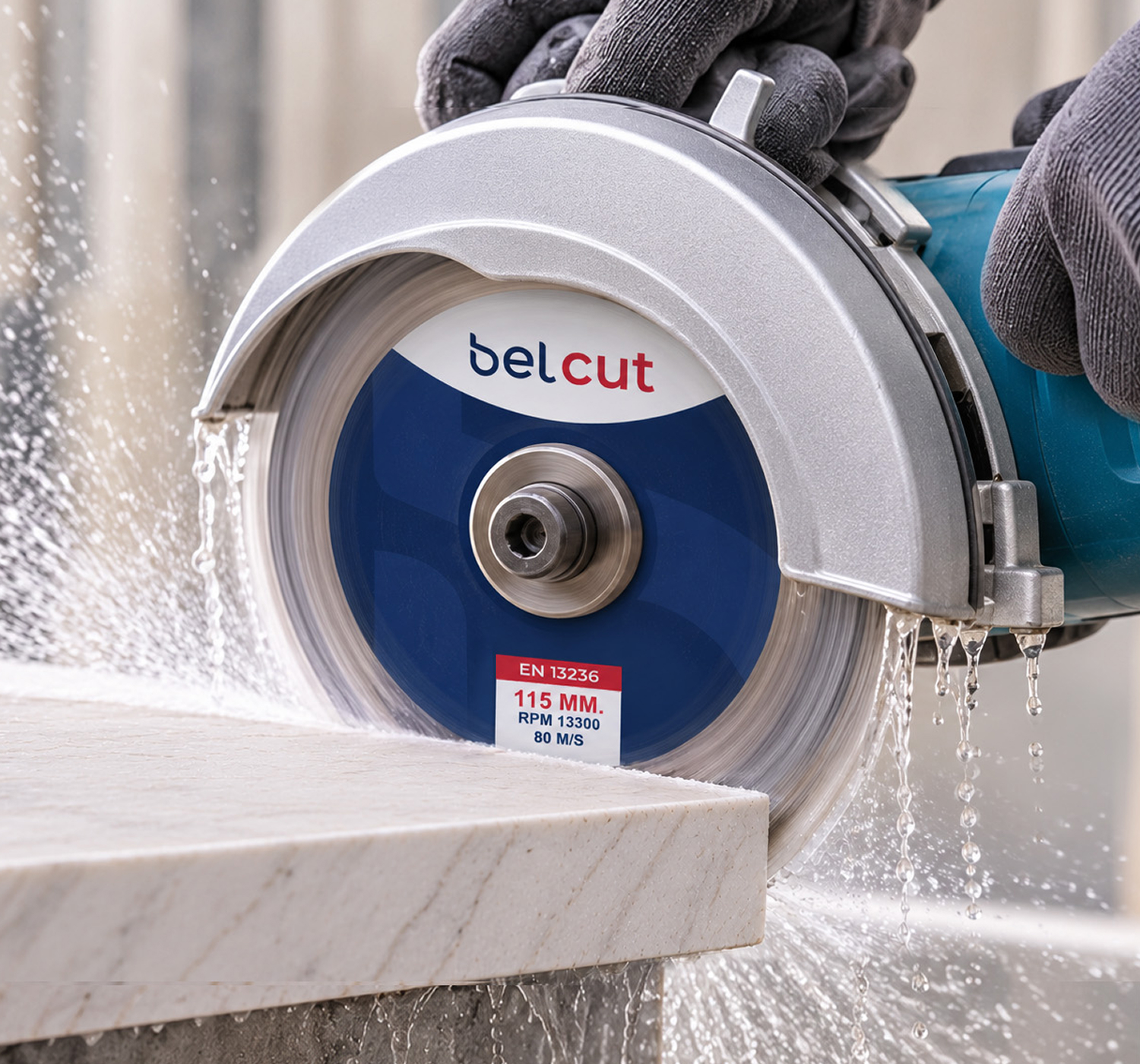
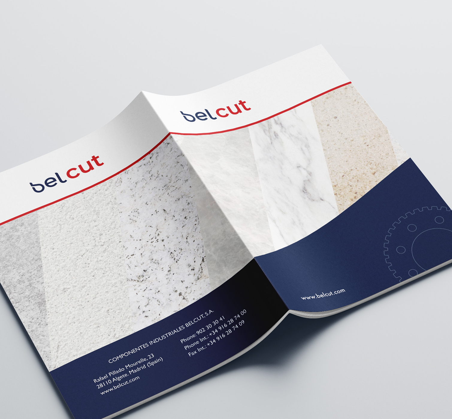
A unified visual system was created using shared typography and dark navy as the primary brand colour. Blue was introduced for BelCare to reflect the cleaning and care products, while a bold red was chosen for BelCut to give it a stronger character, referencing the stone cutting process.
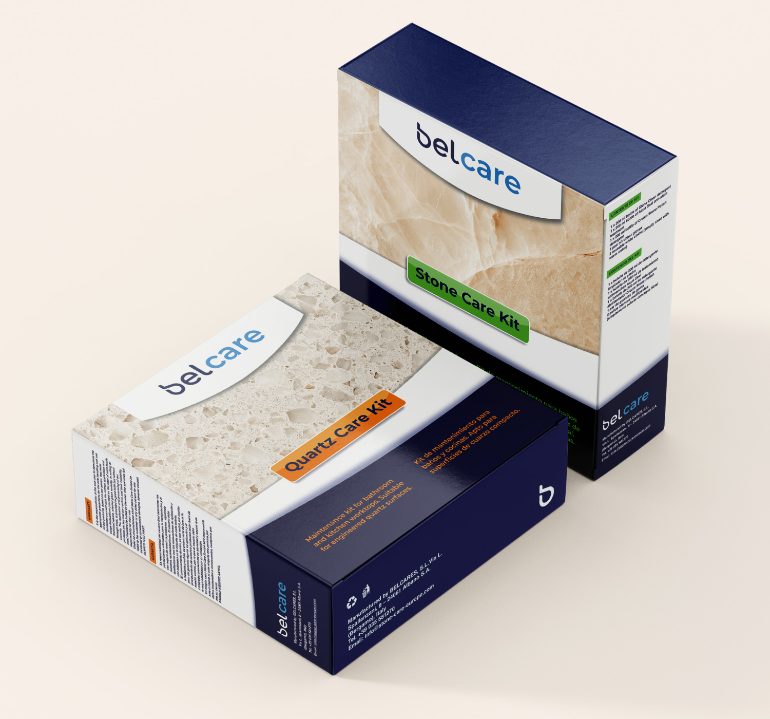
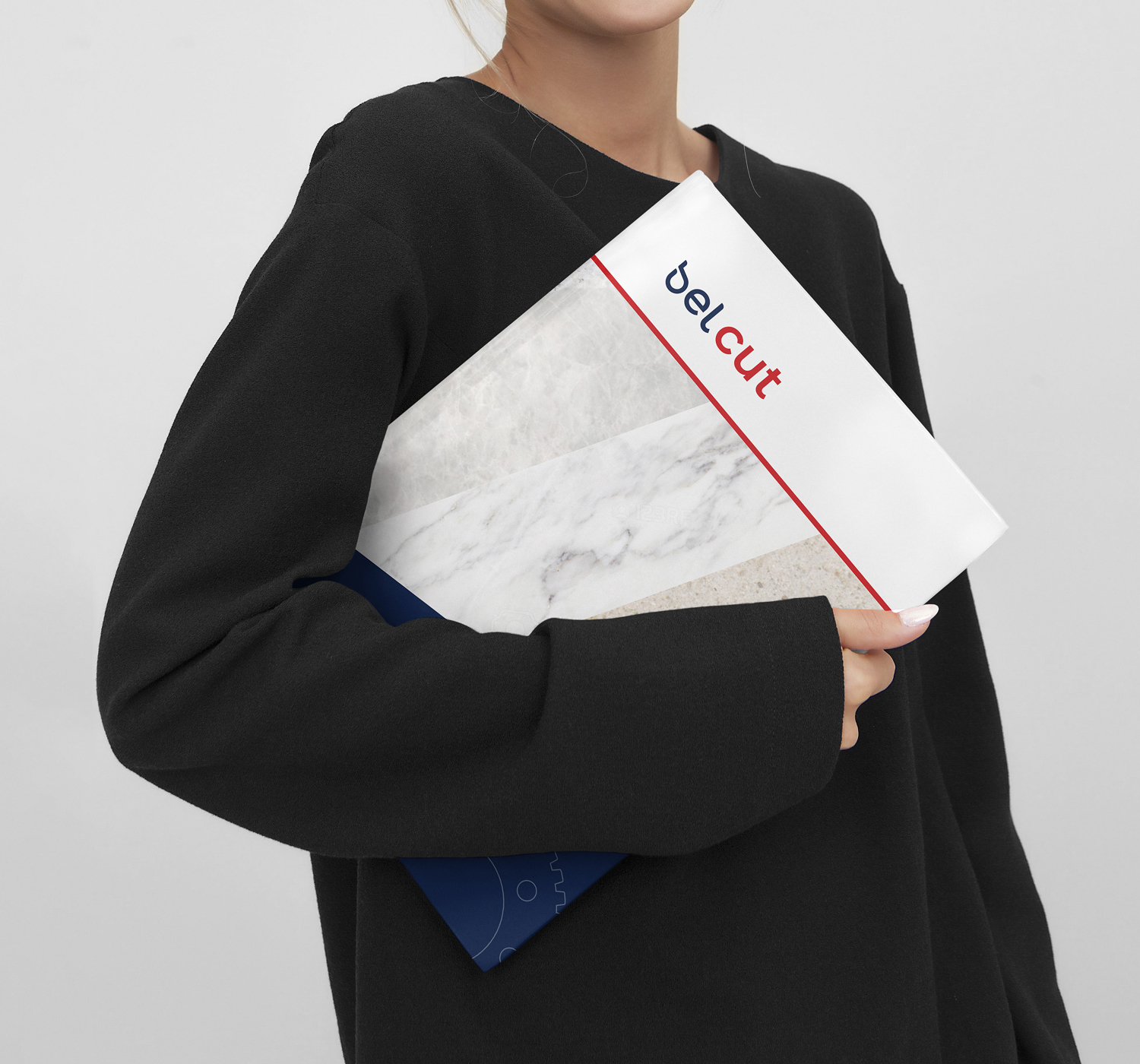
Curved graphic elements inspired by the logo were used throughout the brand, alongside stone-inspired textures, creating a cohesive and recognisable brand.